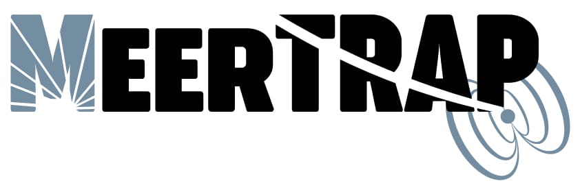
MeerTRAP Logo Redesign
MeerTRAP Logo Redesign
Illustrator CC, 2018
The original MeerTRAP logo was made by one of the scientists on the team and was well received, but was a bit too busy. They wanted to keep the Swoop through “TRAP” to show an FRB signal while also incorporating a pulsar, and South Africa. Obviously this was no small order. My first set of designs below feature the country of South Africa, the Radio telescope, the pulsar and the FRB signal.

After an internal review, they agreed that it was again a bit too busy, and as the team is larger than just South Africa they wanted to cut that out. They requested an option with a Meerkat since this is what the team was named after, but with a pulsar next to its ear so that it is “listening” to the pulsar. The requested “desert-like colors” since the telescope is in the desert. My revision is below (sketch provided by Client).

After another internal review, we all agreed we most likely didn’t want to use the Meerkat, as it looks a bit like a company that traps Meerkats. Agreeing to go a bit more abstract with the logo, we finally arrived at a logo that included the South African Radio telescope dish surface, a pulsar, and the FRB signal.

