Fourth Wall Design Solutions Re-brand
Fourth Wall Design Solutions Re-brand
Company re-brand – 2017
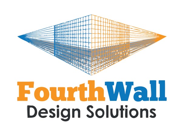
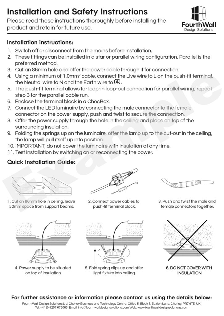
I was contacted by Fourth Wall to update their logo in 2016. The image to the left is an Illustrator trace of the original logo, since the original logo was barely 100 x 100 px and was hardly usable.
Working with the owner and partners, we discussed what they liked about the logo and where there would like to see improvements. They agreed that they loved the orange and blue and the idea of the grid, but wanted something that would be easy to use in various media.
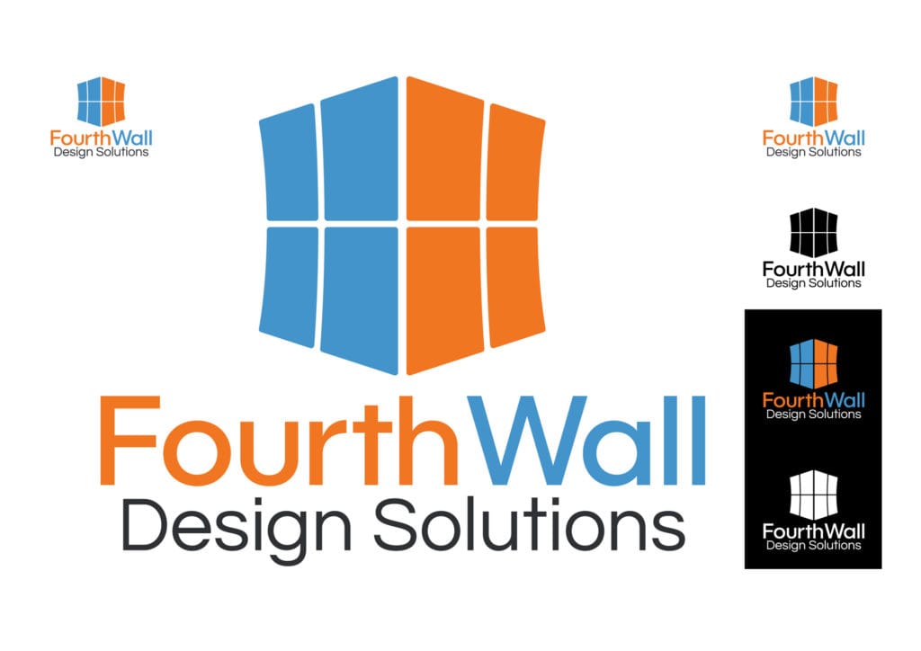
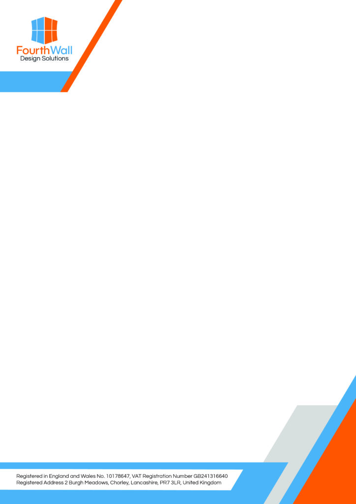
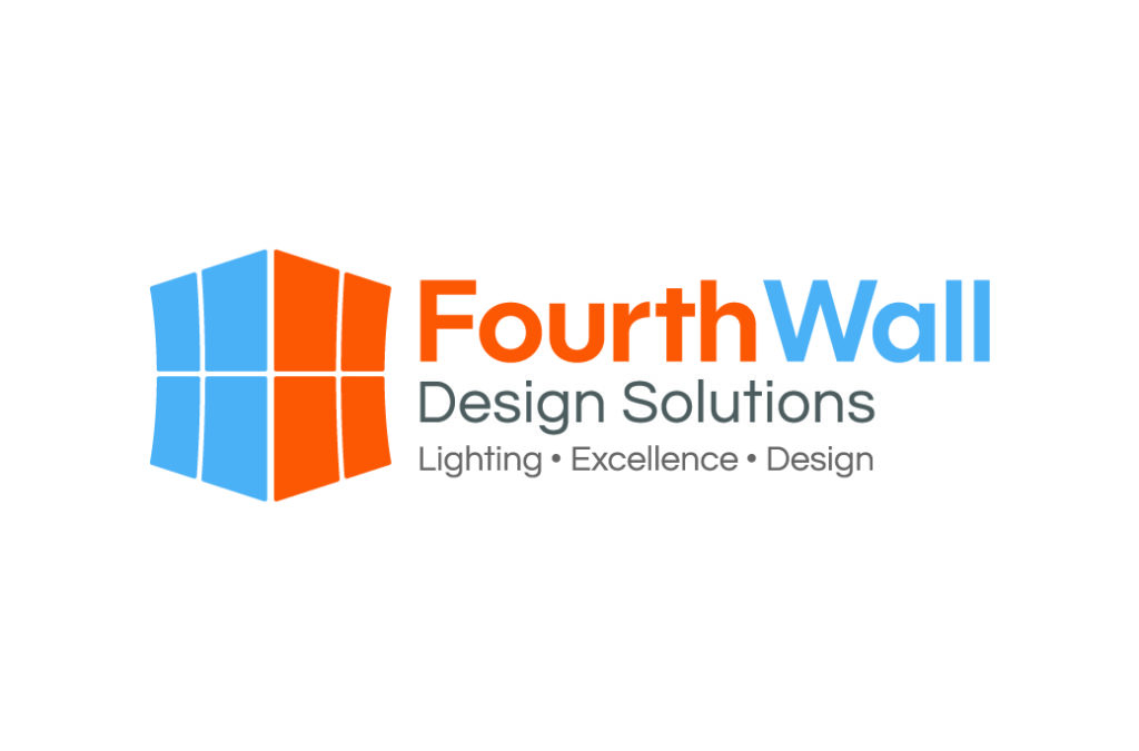
Keeping the original idea in mind, I simplified the grid down to eight squares and added a slight curve to add some visual interest. I softened the original colors into something that was easier on the eyes, but was still vibrant enough to give it a bit of a pop. I then reduced the contrasting color on “Design Solutions” to a light-medium gray and strengthened the font to make it easier to read.
The Final Logo

The final version was approved instantly and easily provided a foundation for them to create their company style and branding guidelines.
